Close
Blaze
Branding

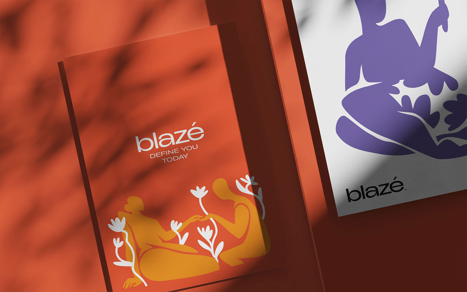
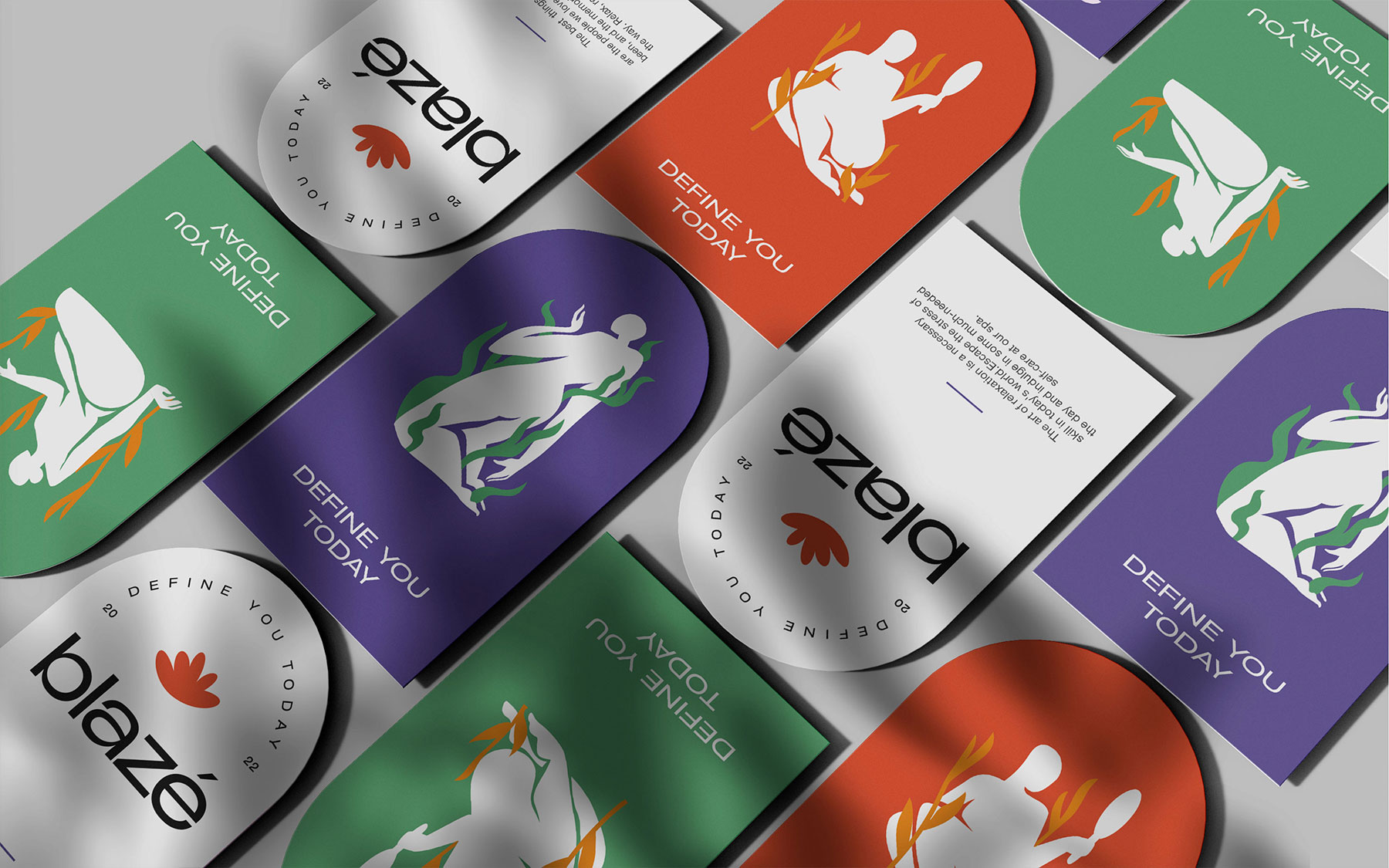
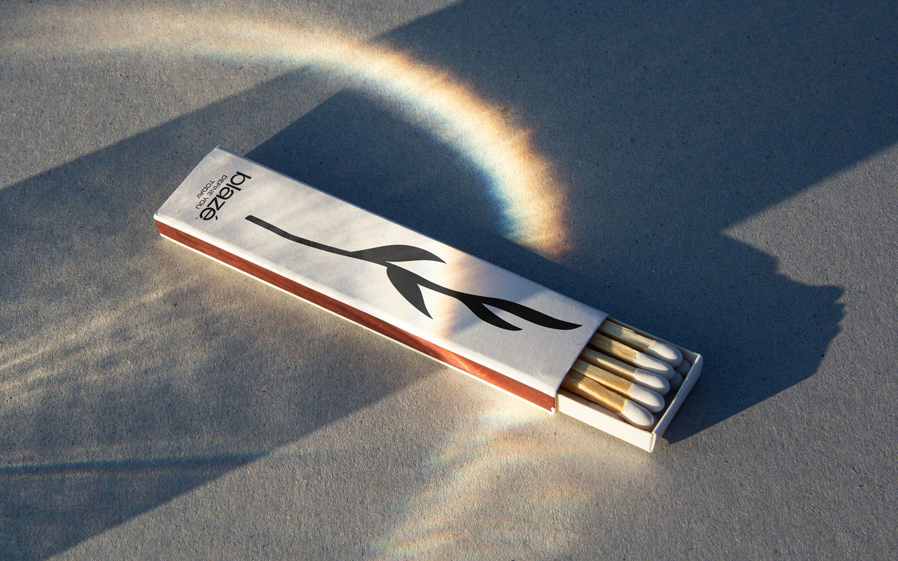
When we were choosing the name, our goal was to choose one that was meaningful, had a short pronunciation, beautiful writing, and was easy to remember. Among the name options, the name Blaze best described the center's message to its customers. In addition to being modern, the name Blaze also suggests energy, vibrancy, and transformation elements that are well-suited to the services you provide to assist customers in feeling and looking their best.

Establishing a powerful brand identity requires giving serious thought to a name that is meaningful, pronounced simply, elegantly written, and memorable. "Blaze" is a good fit for your medical institution as it seems to embody these characteristics.

Read more

More projects

Close
  • What we did
  • Naming
  • Logo Design
  • Strategy & Positioning
  • Brand Identity
  • Tone of Voice

When designing Blaze’s logo, we concentrated on combining luxury, modernism, and simplicity in a seamless way to provide a unified and eye-catching visual identity. Red, orange, purple, and green are the colors we choose to represent power, vitality, and determination. They also reflect the delicate character of our aesthetic core. 

We applied this careful design process to a number of components, including room markings inside the center, social media symbols, and uniforms. Not only do these elements help clients travel more easily, but they also serve to differentiate distinct locations.

We have designed a variety of products, such as landing pages, gift cards, business cards, menus, paper bags, brochures, mugs, pens, tissue boxes, and a brand book. Our graphics and minimalistic symbols, which take influence from Matisse, perfectly convey Blaze's contemporary and artistic vibe.