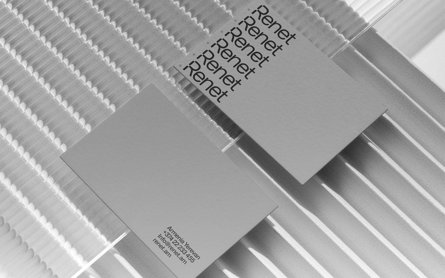
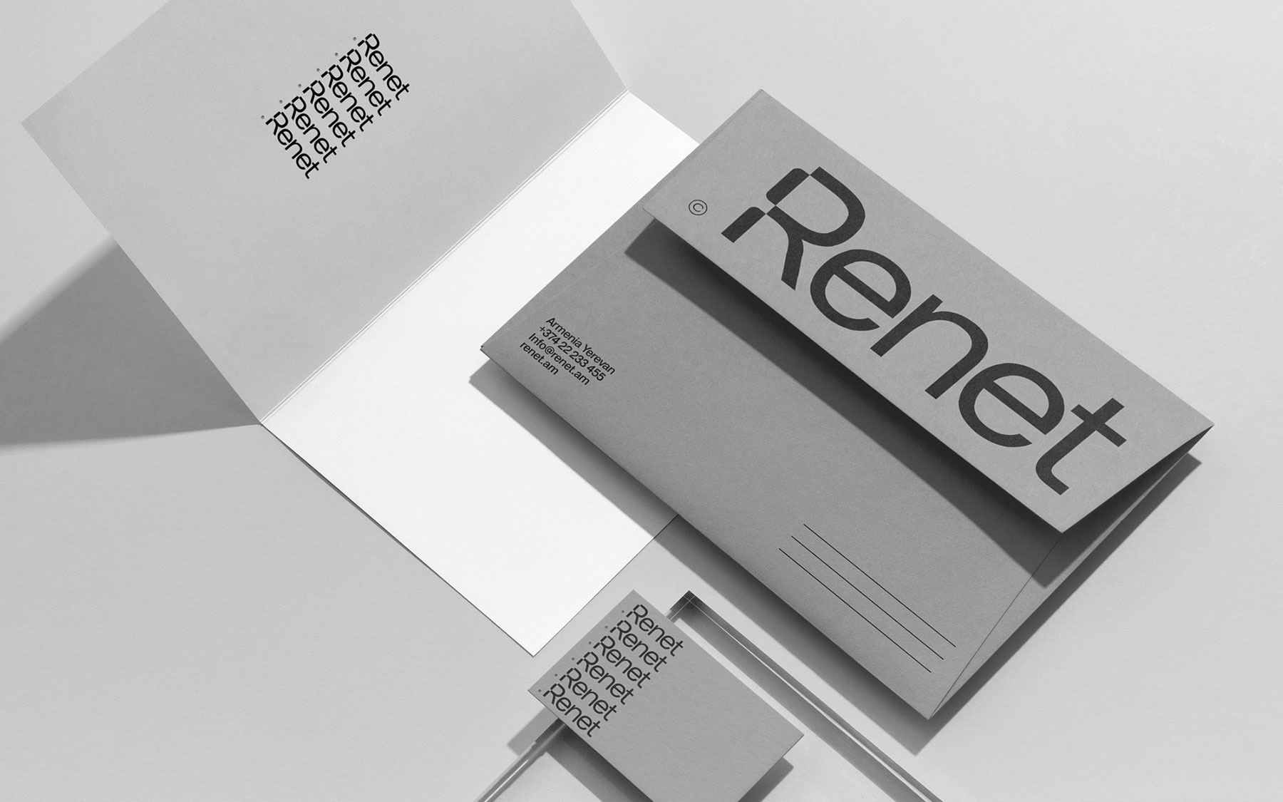
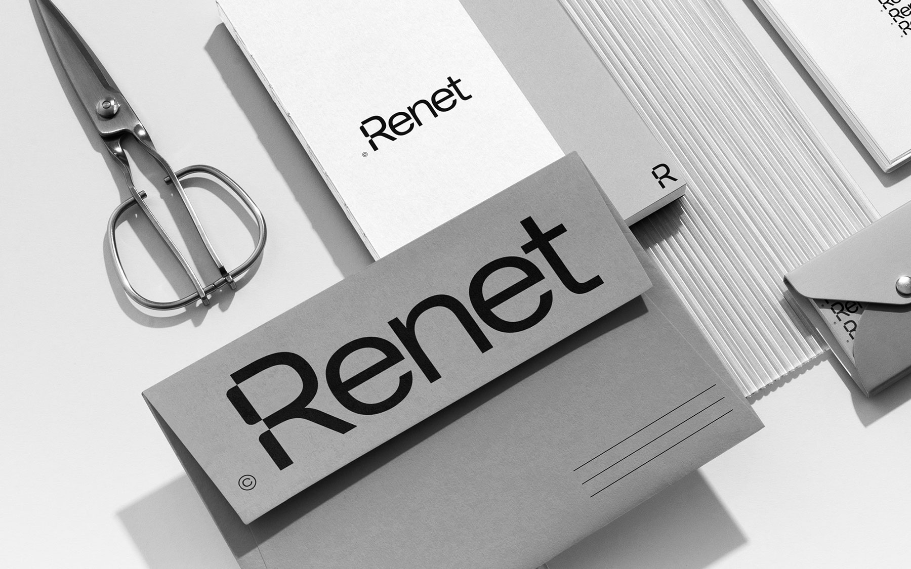
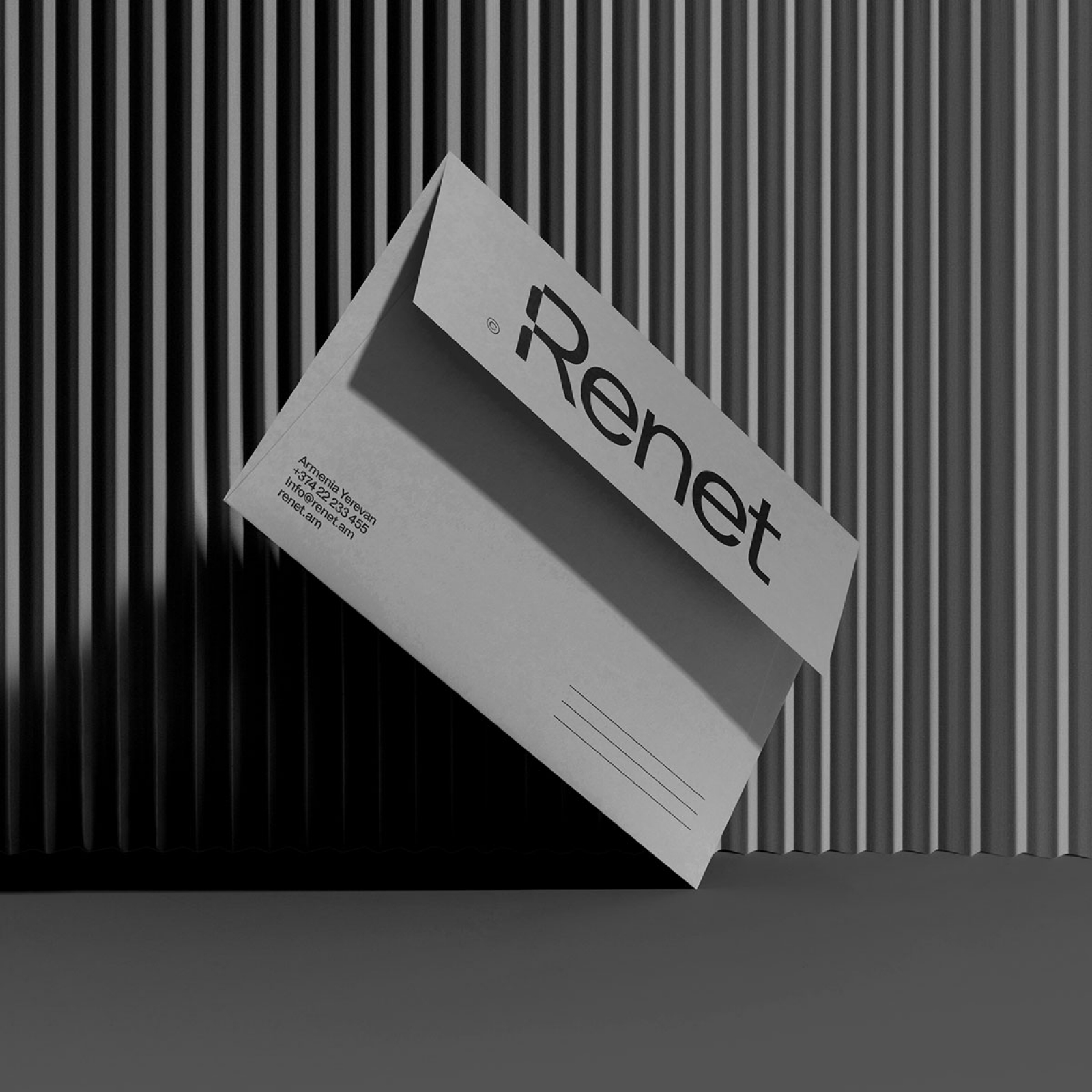
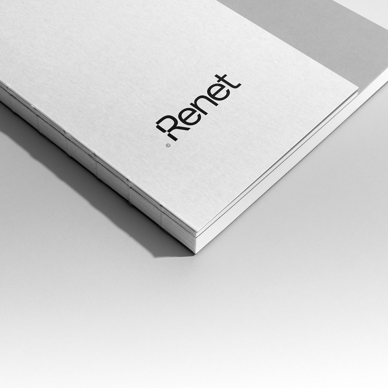
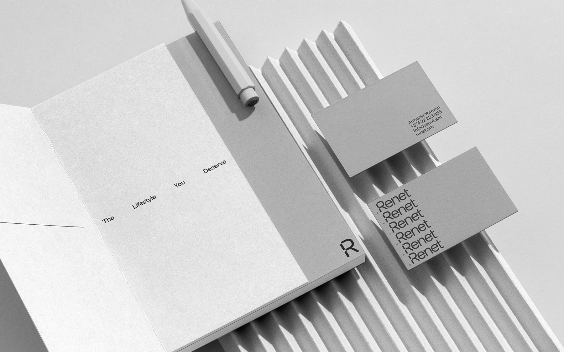
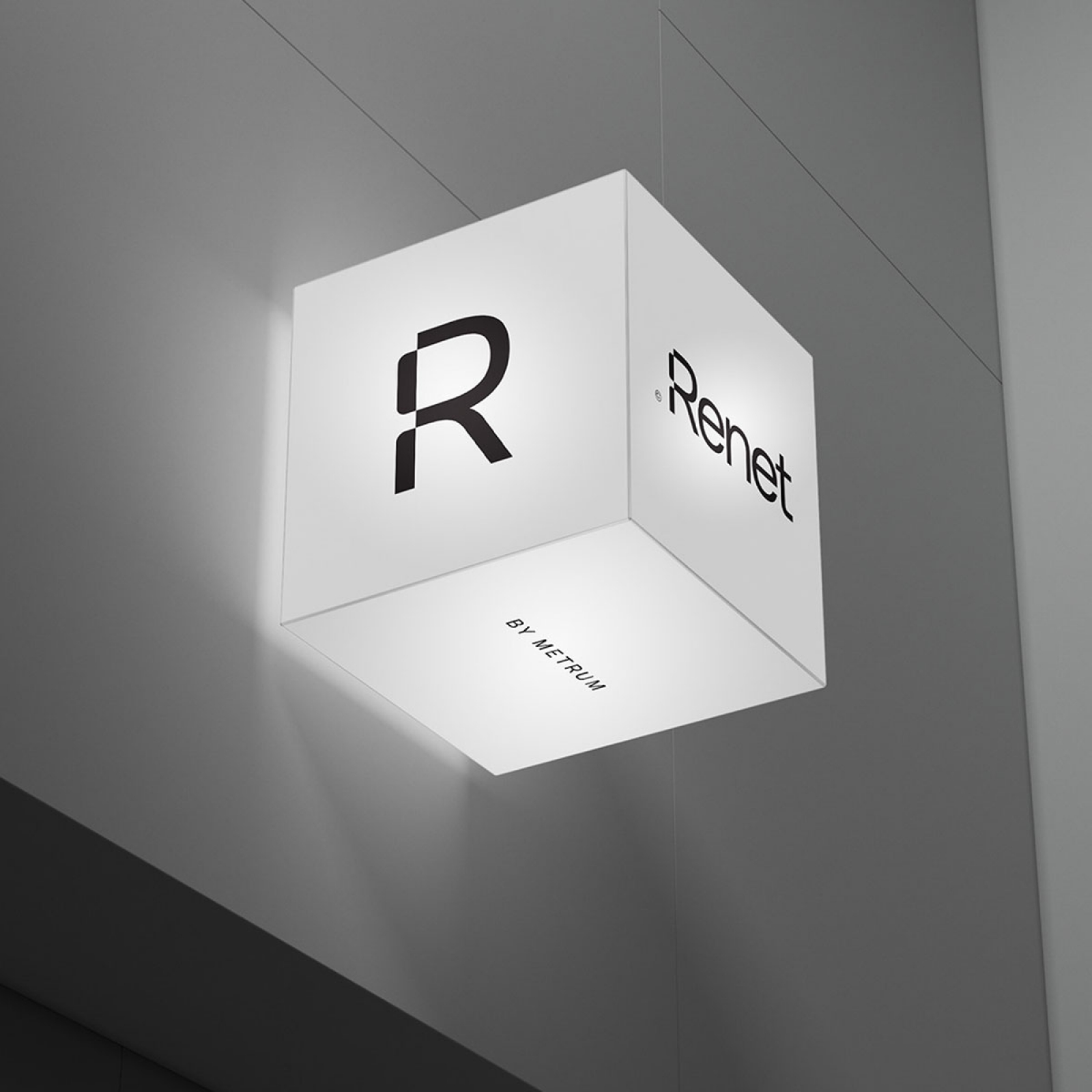
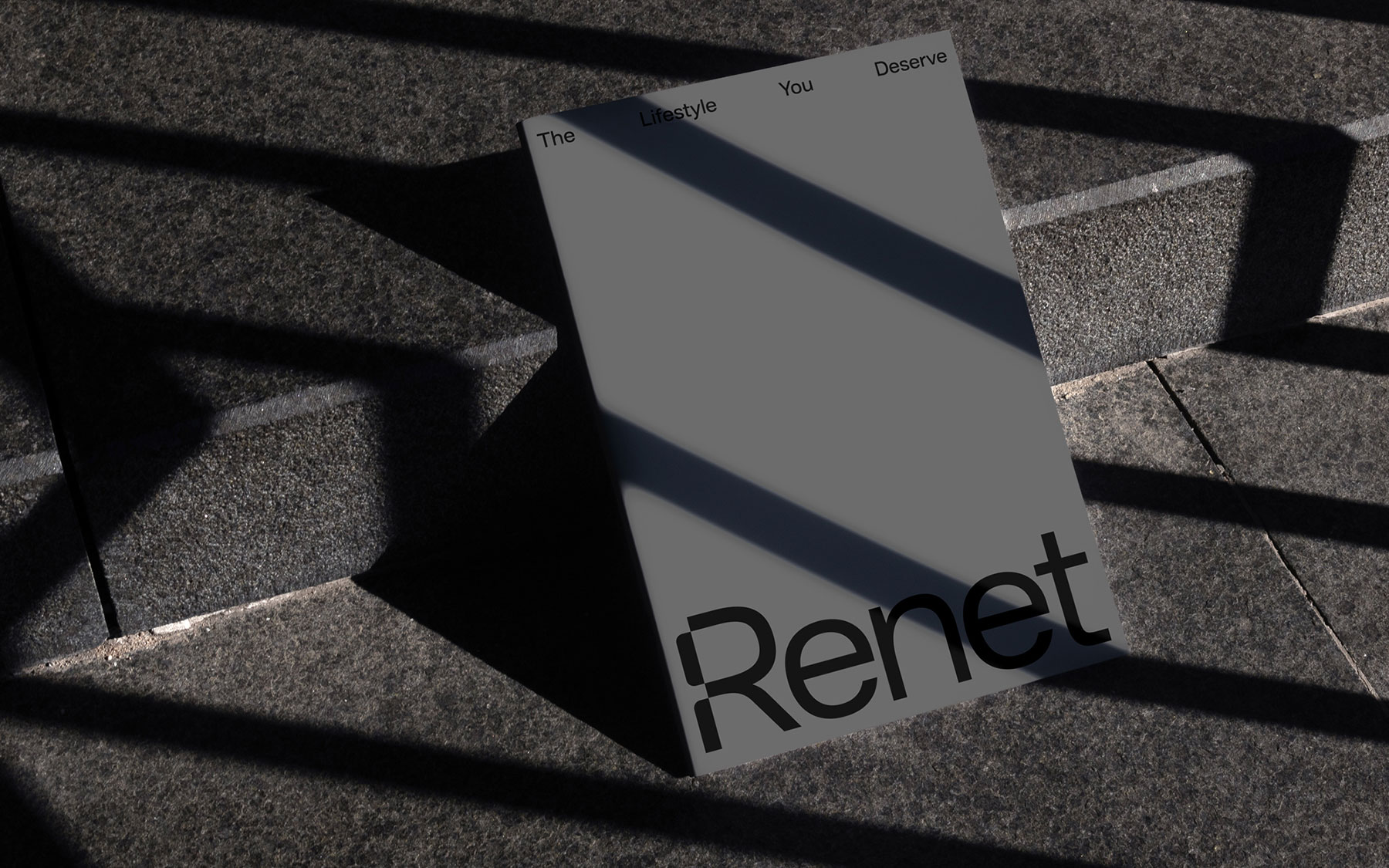
Close
Renet
Branding

Understanding Renet's goals and mission came first for us. Based on this information, we developed a comprehensive brand strategy that described the guiding principles, positioning, and key messages of Renet. Based on the logo, we developed a cohesive visual identity system, selecting a color palette and defining typography guidelines that represent dependability, refinement, and modernism.

Read more

More projects

Close
  • What we did
  • Naming
  • Logo Design 
  • Brand Identity

We tried to make the simple design of the building clear. We were cautious with color separations when developing the printed files and their application in order to maintain the minimalist appearance. We made sure that every element embodied the minimalist design of the structure.

We ensured ongoing brand management throughout the process, providing guidance and support for consistent brand application and making the necessary modifications or improvements. Our objective was to develop a branding experience that would have a lasting impact on Renet's target market.

We were able to successfully design Renet's branding after going through this painstaking procedure, establishing a strong basis for its success in the real estate sector. We created a distinctive visual identity for Renet by fusing our experience in brand strategy and design. This logo distinguishes Renet from its rivals and exudes trust and sophistication