Close
Dive
Branding

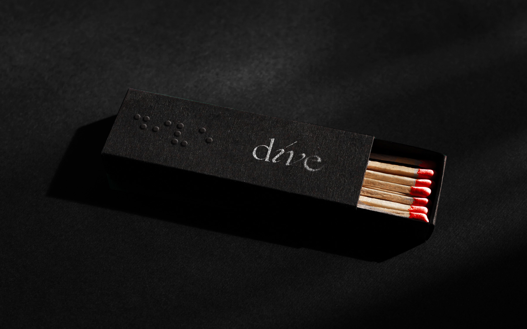
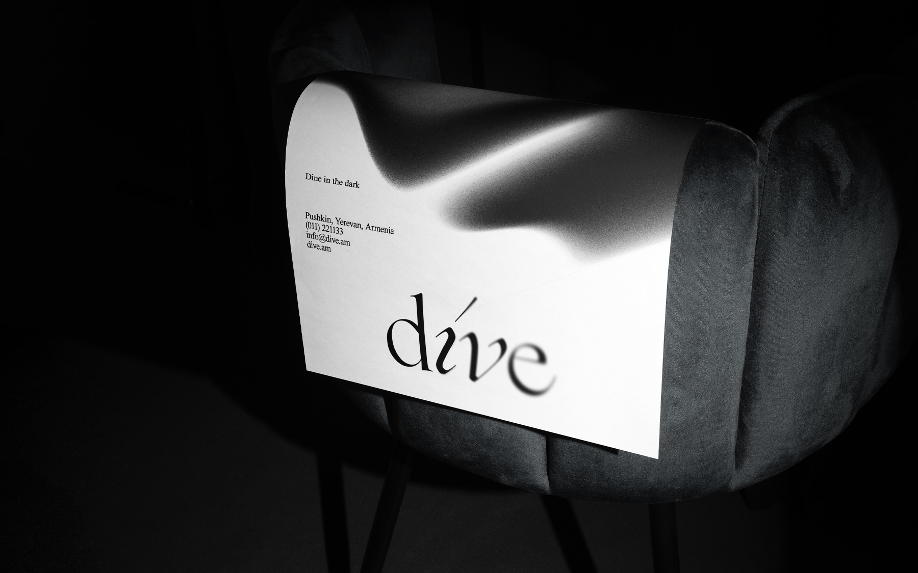
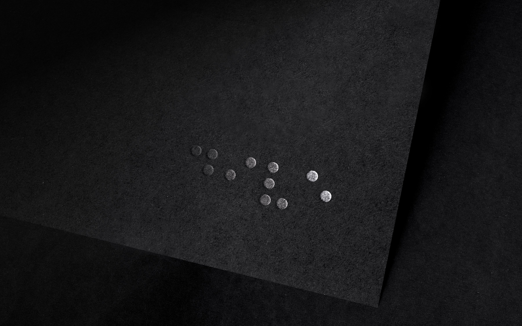
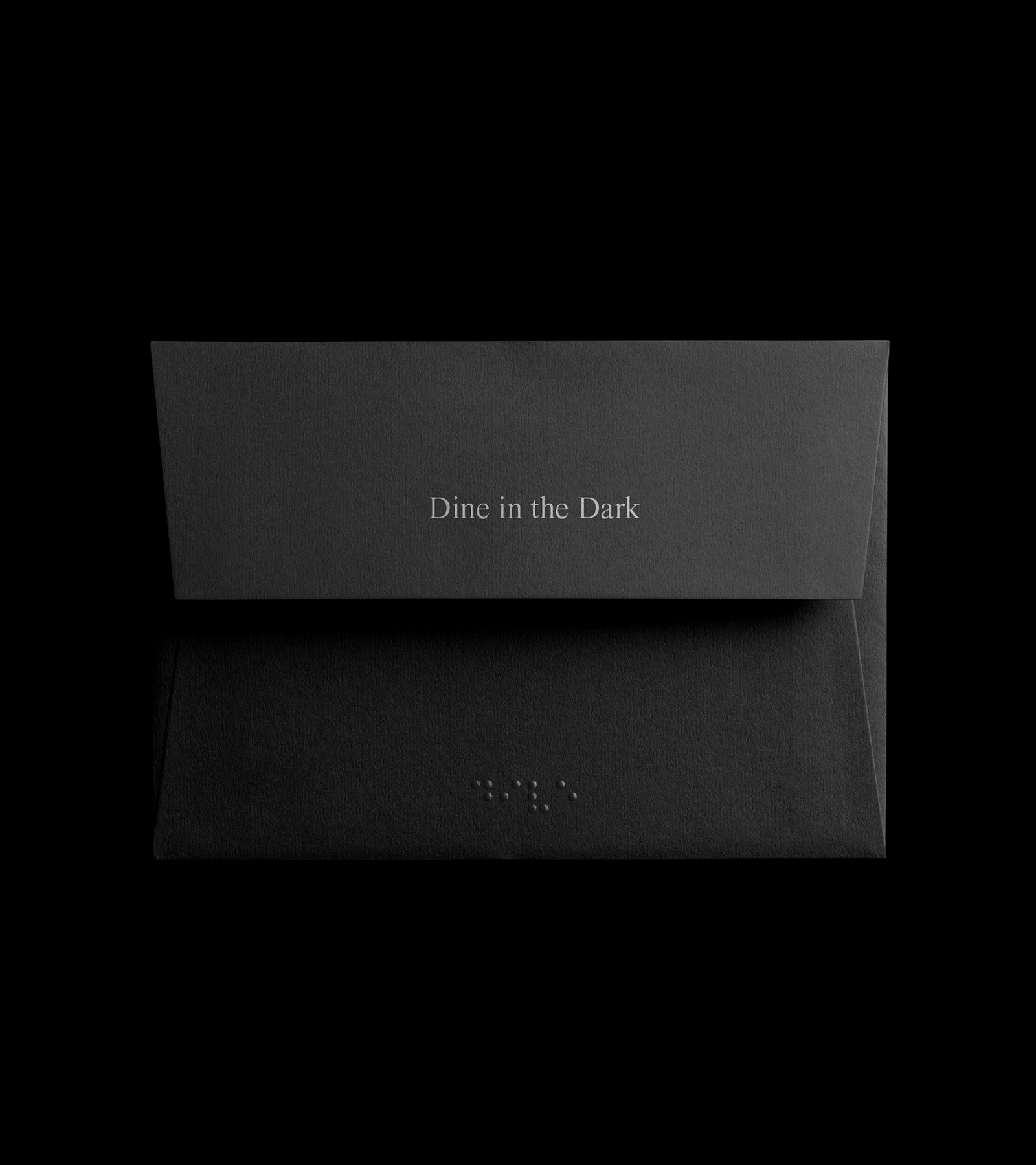
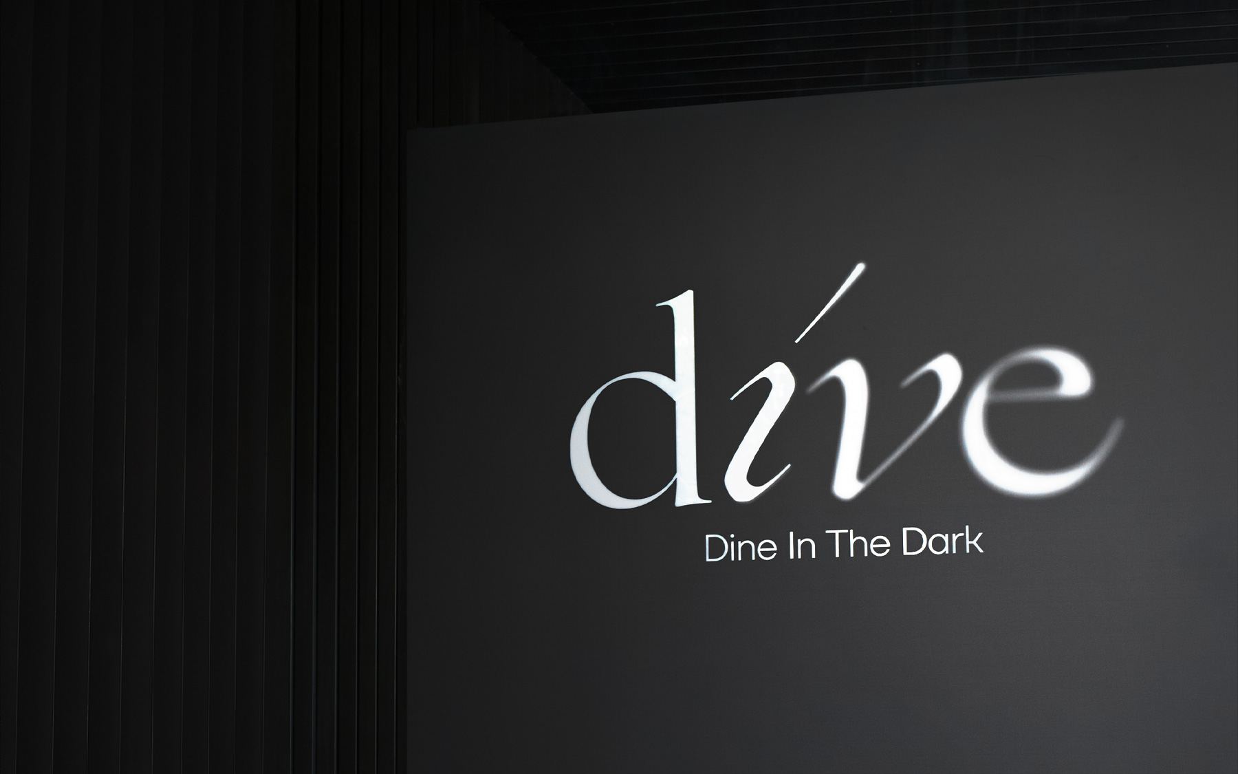
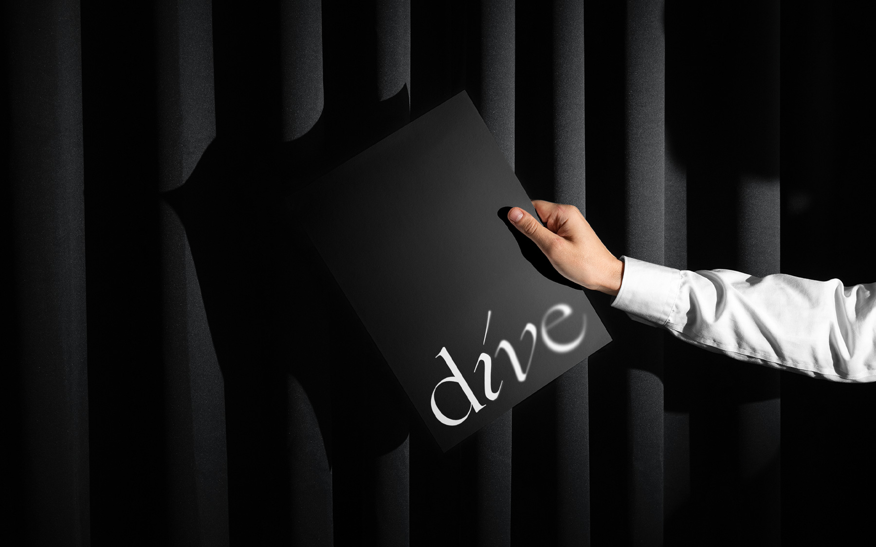
Dive is a unique dining establishment that offers a singular, unforgettable sensory experience. Throughout the branding process, we worked closely with the client to integrate our creative skills with their unique preferences and vision. The result was a powerful brand identity that captures the spirit of Dive and sets it apart in the food industry. Our intention while designing the Dive logo was to create something genuinely unique and thought-provoking. Dive's brand was given a distinctive touch by the clever integration of blind man alphabet symbols into the logo design.

Read more

More projects

Close
  • What we did
  • Logo Design
  • Brand Identity
  • Social Media Marketing

Dive is an extraordinary restaurant that offers a truly unique and unforgettable sensory experience.

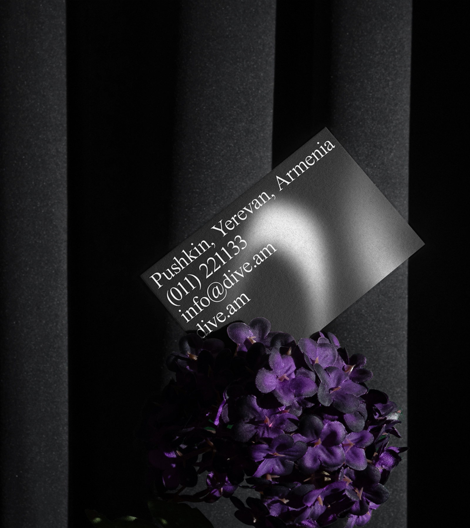
Shadows are used in Dive's branding to represent the absence of light and to create an enticing, enigmatic appeal. This logo not only draws attention, but it also tempts customers to go on a remarkable gastronomic journey. The use of shadows was crucial in establishing Dive's brand identity since it highlighted the absence of light inside the restaurant setting.

Dive's visual design purposefully employs gloomy elements to create an ethereal and fascinating feel. By enhancing the total sensory experience, this play of light and shadow immerses guests in a setting that piques their imagination and sense of taste. 

Beyond just the logo, we also worked on other design aspects, such as the menu and website. Every component was chosen with care to enhance Dive's main brand idea.

As a result, a captivating brand identity was created that perfectly captures the essence of Dive and distinguishes it in the culinary world. When designing the Dive logo, we wanted to create something truly unique and thought-provoking.
The use of blind man alphabet symbols in the logo design was a stroke of genius and this was a result of the brand’s “people-first” strategy.