Close
Yerevan Metropoliten
Rebranding Concept

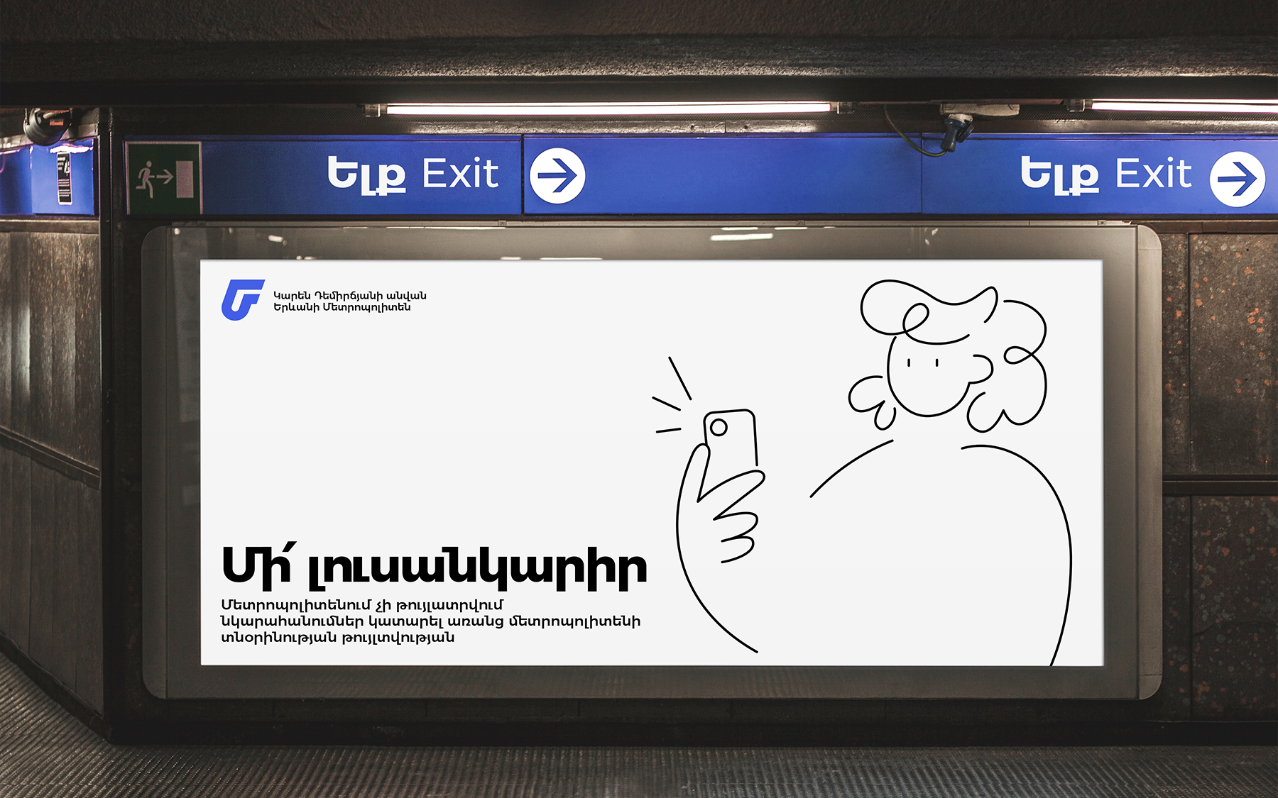
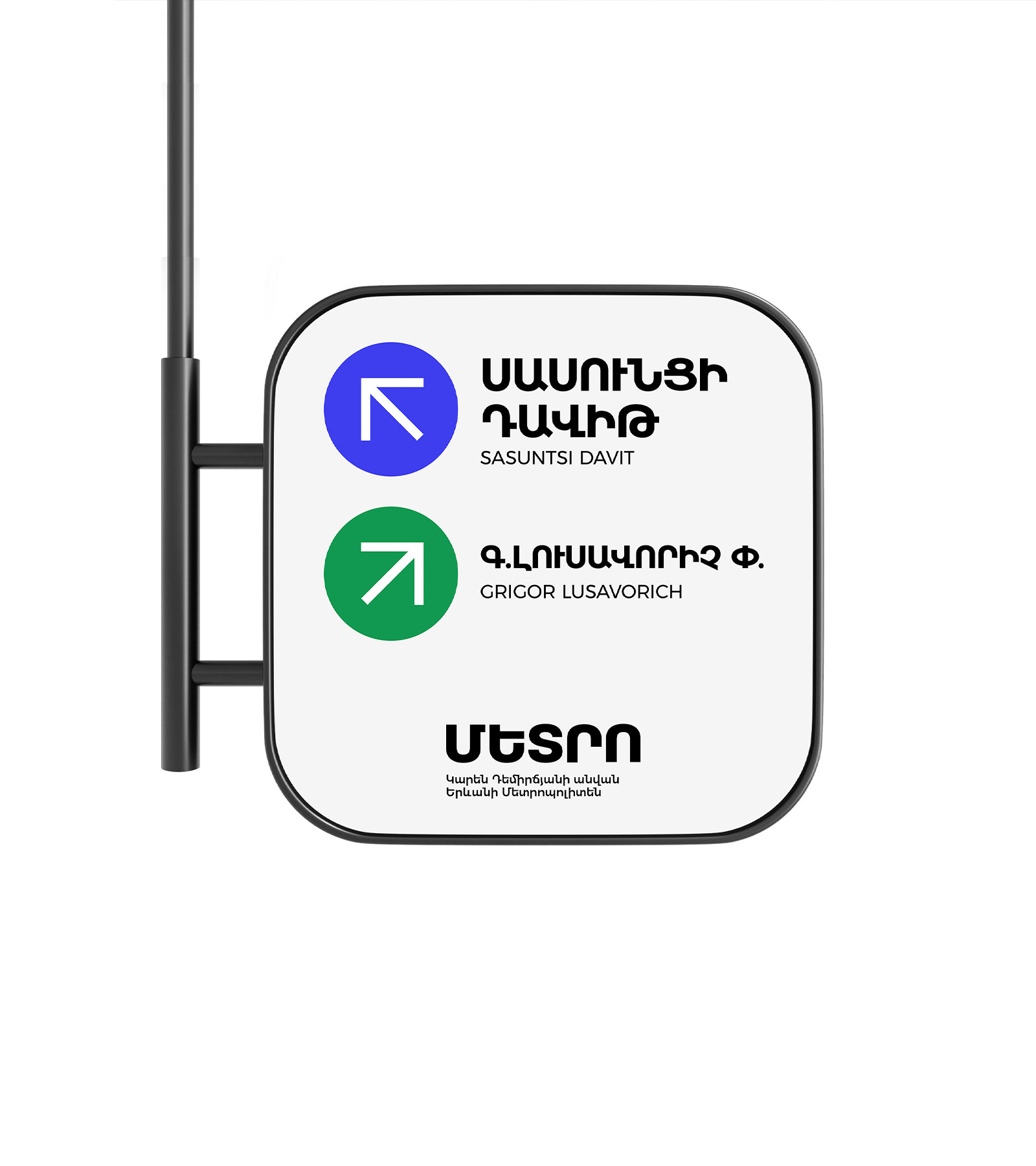
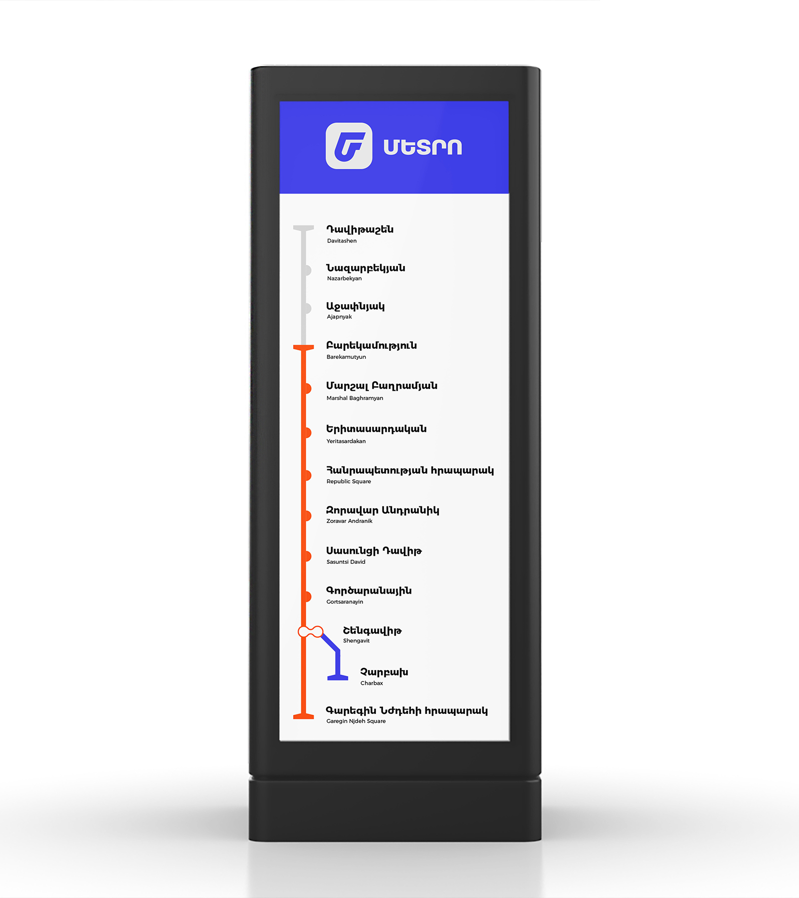
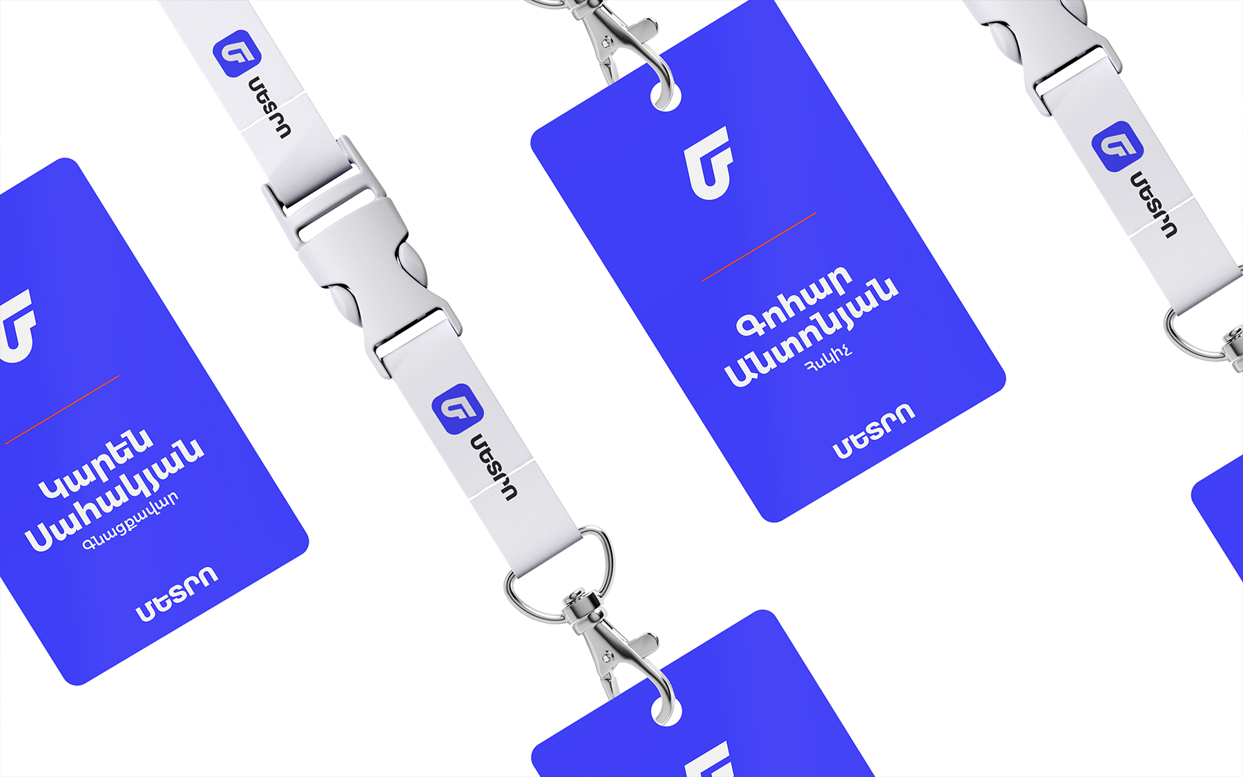
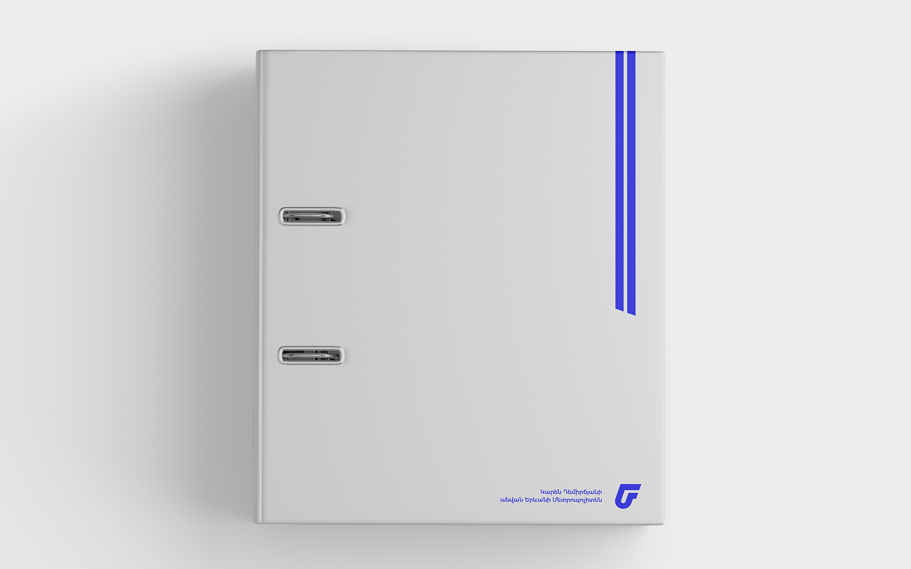
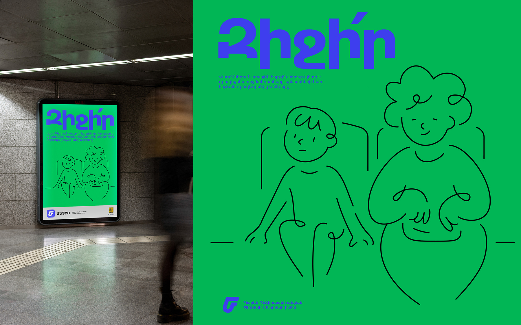
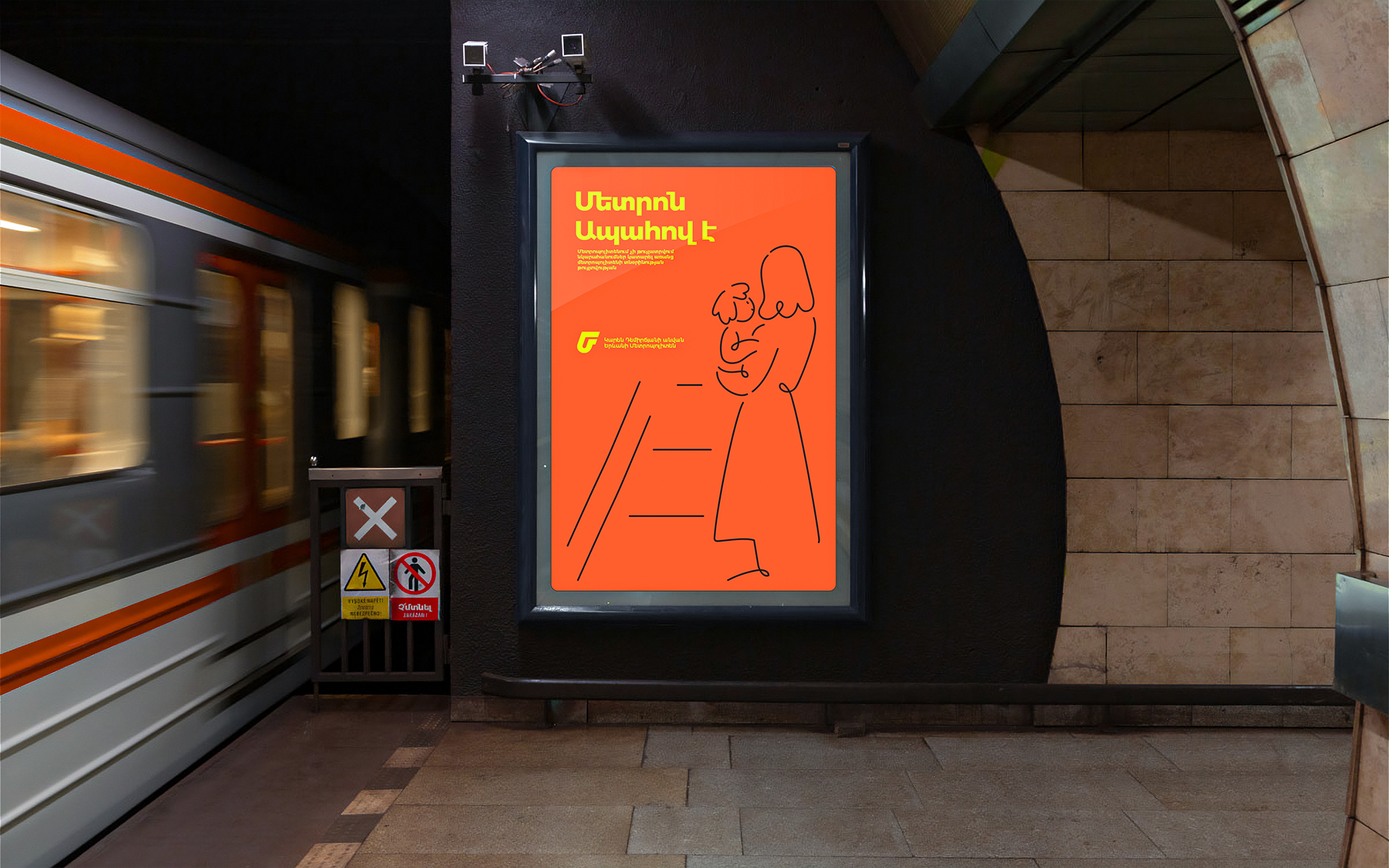
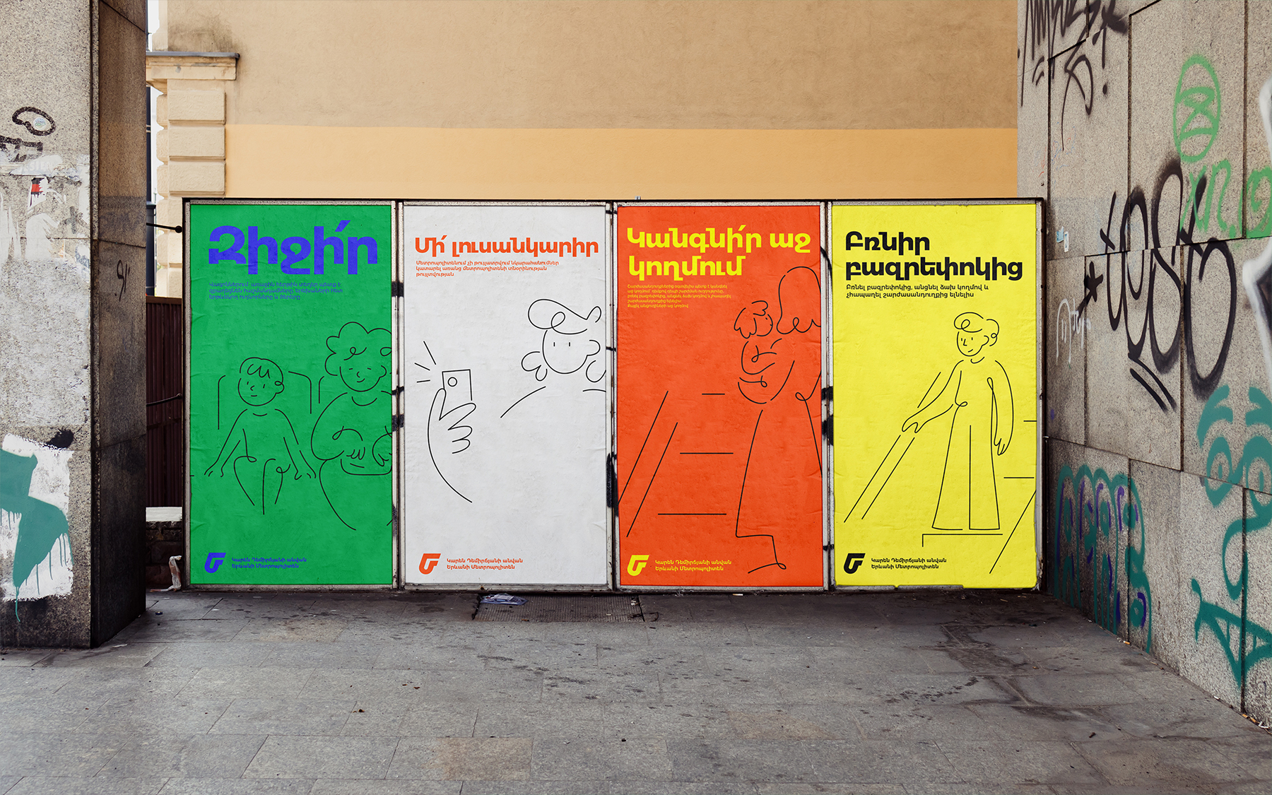
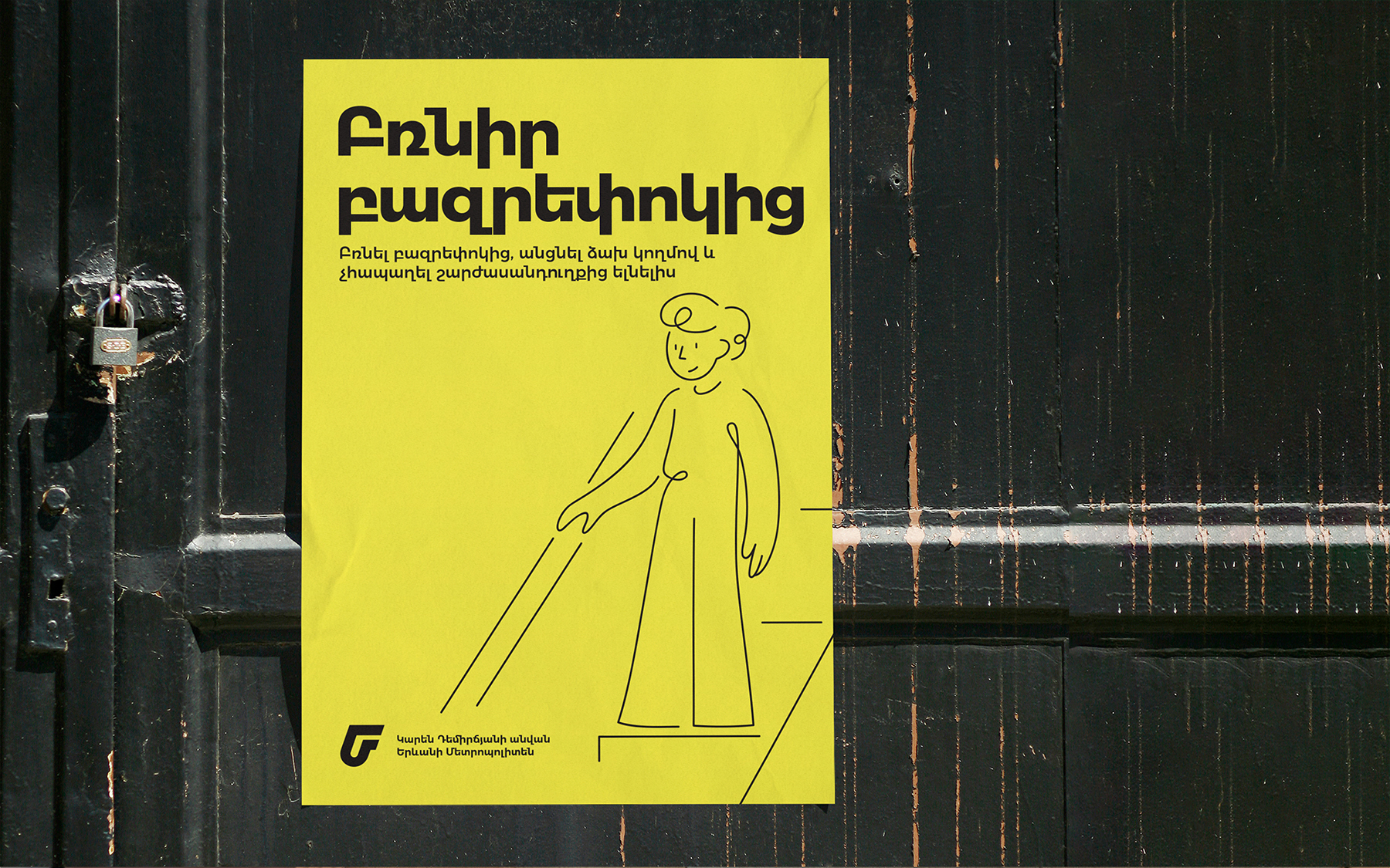
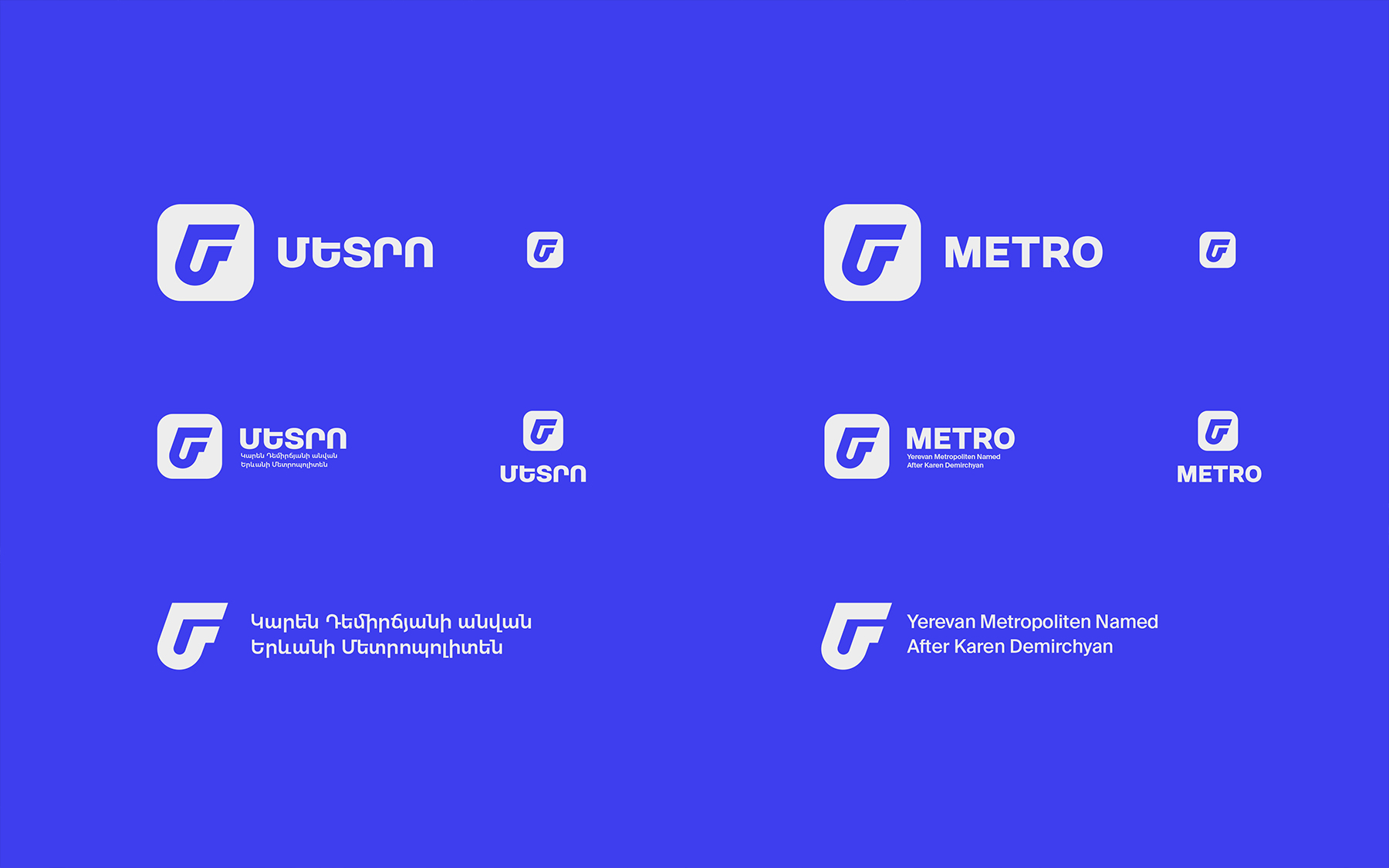
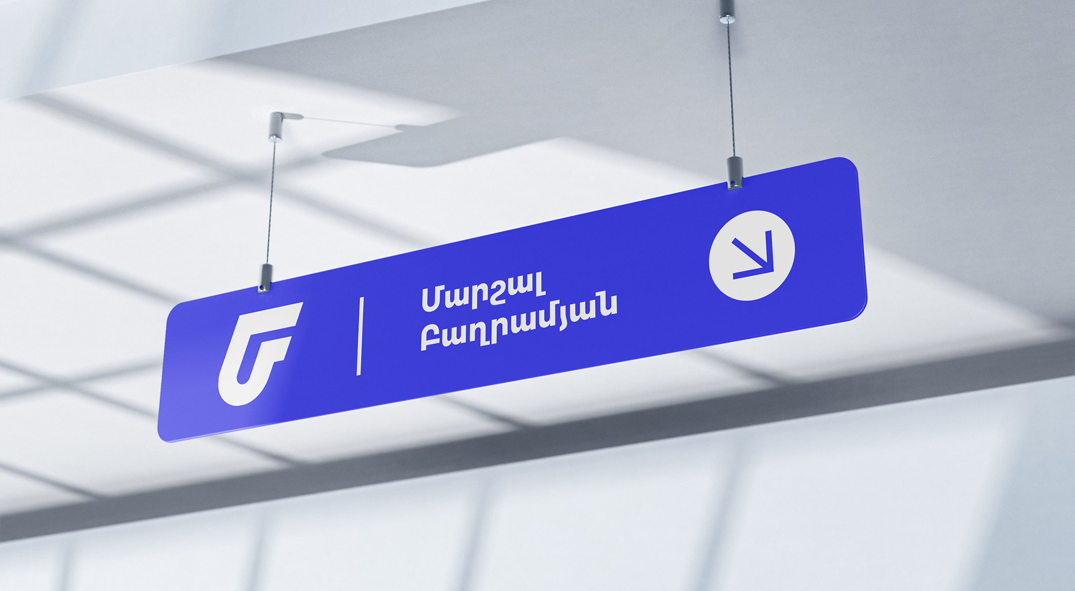
Our branding team took on the job and carefully examined the current logo of Yerevan-Metropoliten, pointing out its pros and cons. Our choice to start the redesign process was largely influenced by the review, which sought to match Yerevan's changing perception as a dynamic, young, and forward-thinking city with the logo. The intention was to give the metro's visual identity a more contemporary and vibrant feel.

Read more
Close
  • What we did
  • Logo design
  • Brand Identity


  • Concept

We considered Yerevan's persona in great detail when designing Metro’s new logo. In order to improve visibility and elicit a favorable reaction, we used brighter hues to graphically represent the spirit of the city. 

Our intention is to appeal to both residents and visitors by using colors that represent the inventiveness of the city. We infused tradition with contemporary design to give the well-known emblem a new meaning.


With Metro, we set out to create a visual narrative that captured Yerevan and its metro system, not just a logo.