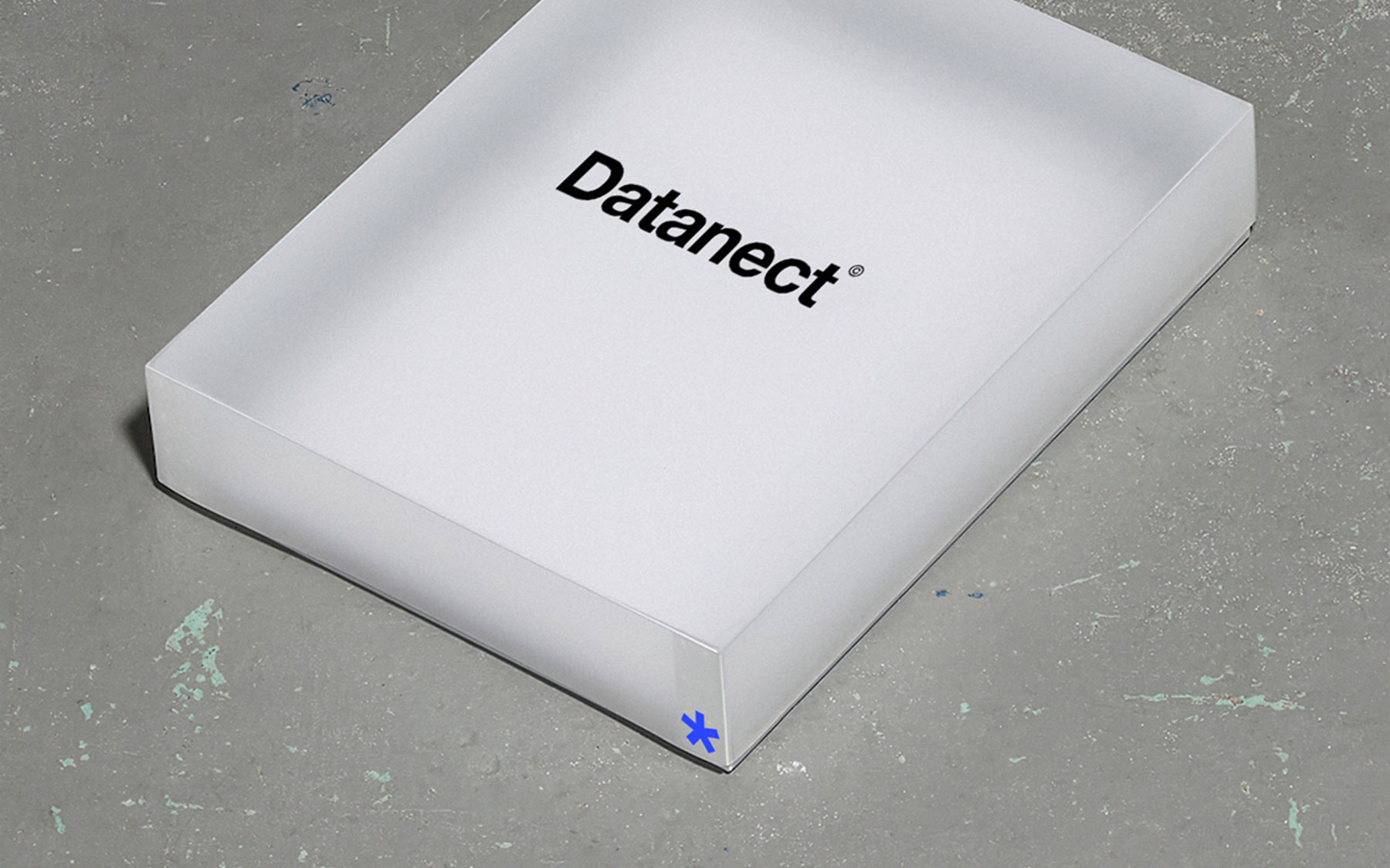
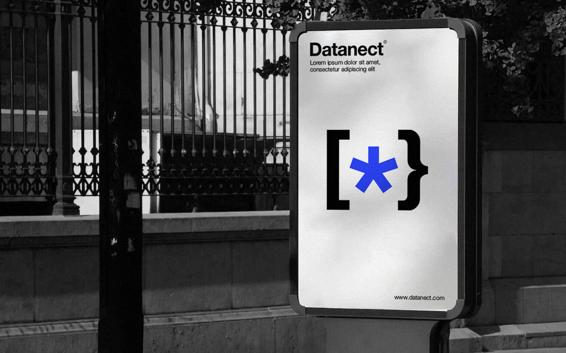
Close
Datanect
Branding

The branding process presented a number of challenges for Datanect, an IT company that specialized in improving the transfer of programming languages. Our team carefully developed a brand strategy to highlight the company's competence and project a sense of professionalism and elegance, utilizing our marketing knowledge. Creating a logo for Datanect that represented the smooth transition and integration of programming languages was a significant challenge for the Digital Factory.

Read more

More projects

Close
  • What we did
  • Logo Design 
  • Strategy & Positioning
  • Brand Identity

We had to provide a clear demonstration of Datanect's capacity to combine several programming languages for smooth cross-platform data transmission. In response, our team designed a sleek black gateway that sits in the heart of the logo, signifying Datanect's strength—the effortless integration of programming languages.

This graphic depiction clearly conveys Datanect's function in promoting inter-coding language communication, making digital information exchange simple. A bright blue asterisk that is deliberately placed in the logo stands for innovation and progress.

The asterisk is a potent symbol for the crucial part that Datanect plays in enabling new chances and possibilities for organizations.It demonstrates the firm's dedication to utilizing technology's revolutionary power and supporting companies in remaining at the vanguard of innovation.